Visualizing the Invisible
Prior to this course, we all had a certain knowledge of extreme weather from news and media. In spite of that, some of us perhaps felt like it was something that had a significant distance to ourselves, and though that there was too little one could do to make a difference. Some felt anxious and insecure upon realising how harmful and dangerous extreme weather can be.
This course however made us understand that we, as design students, may make awareness by utilising our creativity and ability to create art works.
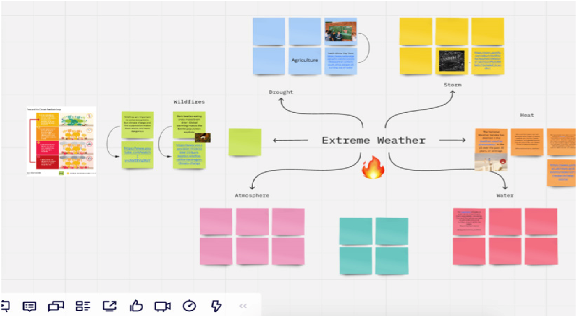
Student works
BA3 DESIGN: Department of Design | Faculty of Fine Art, Music and Design, University of Bergen
Process and concept
With such a broad theme, (extreme weather), there were many opportunities, and we were unsure at first. We eventually decided on global warming as our focal point, mostly out of curiosity on how we could work with it visually.
As global warming is caused by a number of invisible gases such as CO2, CH4, N20 and HFCs, we were faced with the challenge of illuminating or highlighting something that cannot be seen. Visualization of the invisible.
So how to make the invisible visible?
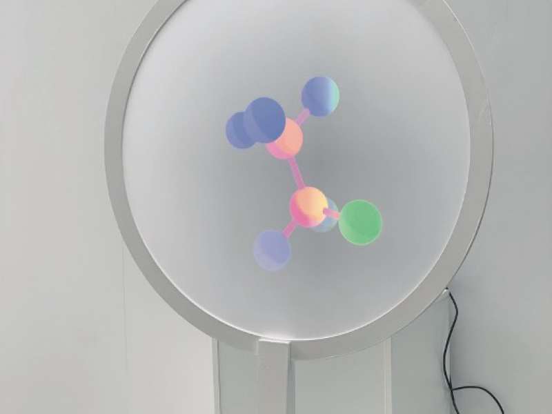
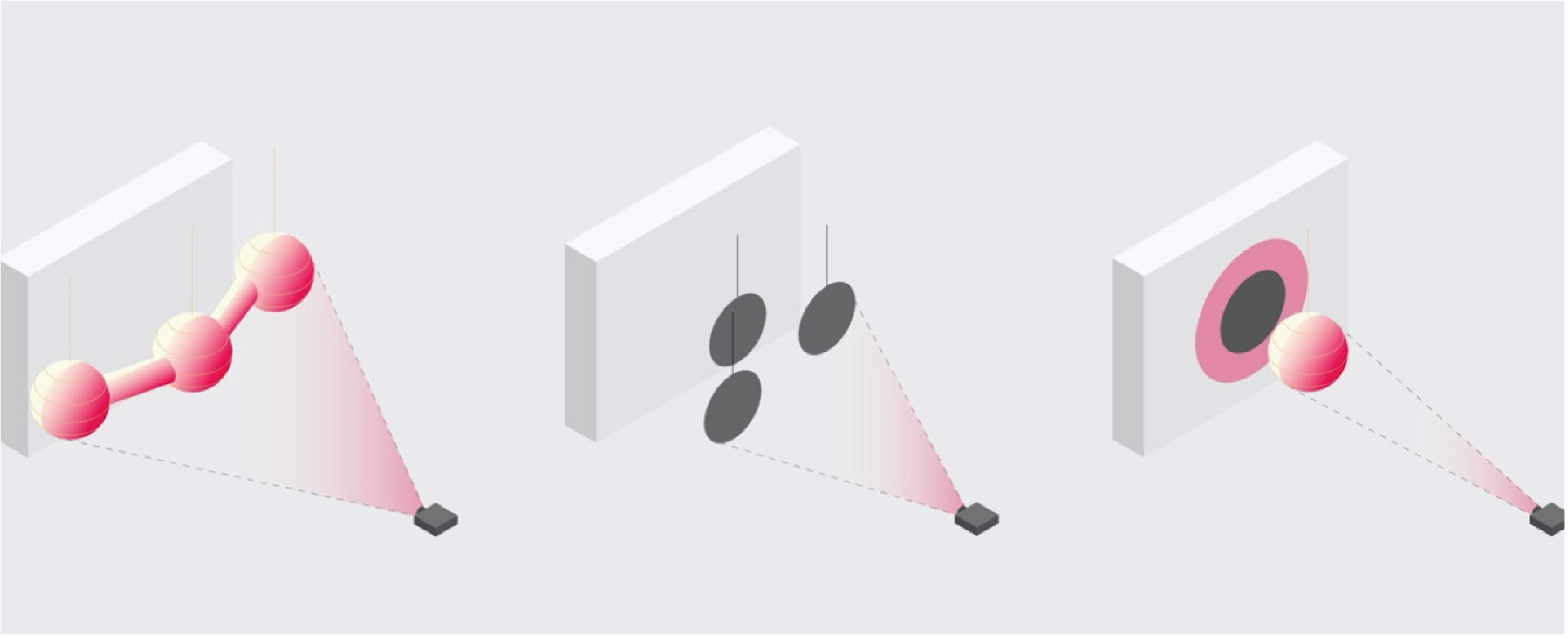
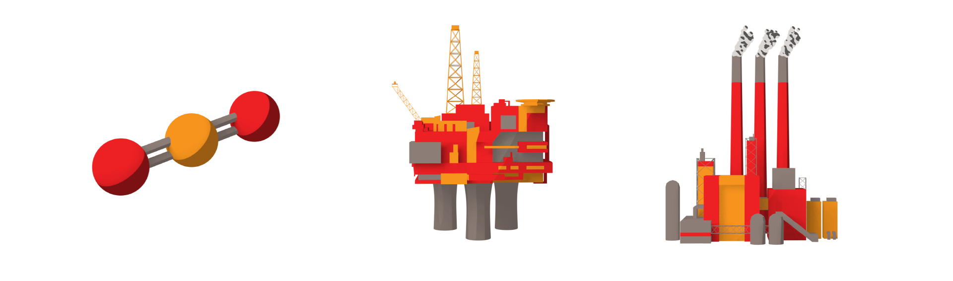
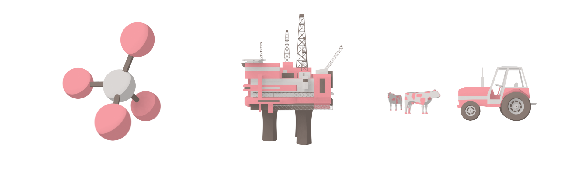
Global warming initiates from gases that consist of molecules. Hence we thought it would be suitable to start the process by focusing on the molecules.
We decided that we wanted to visualize the molecules that account for most of the Norwegian climate emissions. Part of the reason was that we ourselves were not fully aware of what those gases were, apart from the most well-known, carbon dioxide. Our hypothesis was that by using sound and installation, we could make the public sense and become more aware of the threat of global warming.
Initial testing and sketches
Colours and visuals
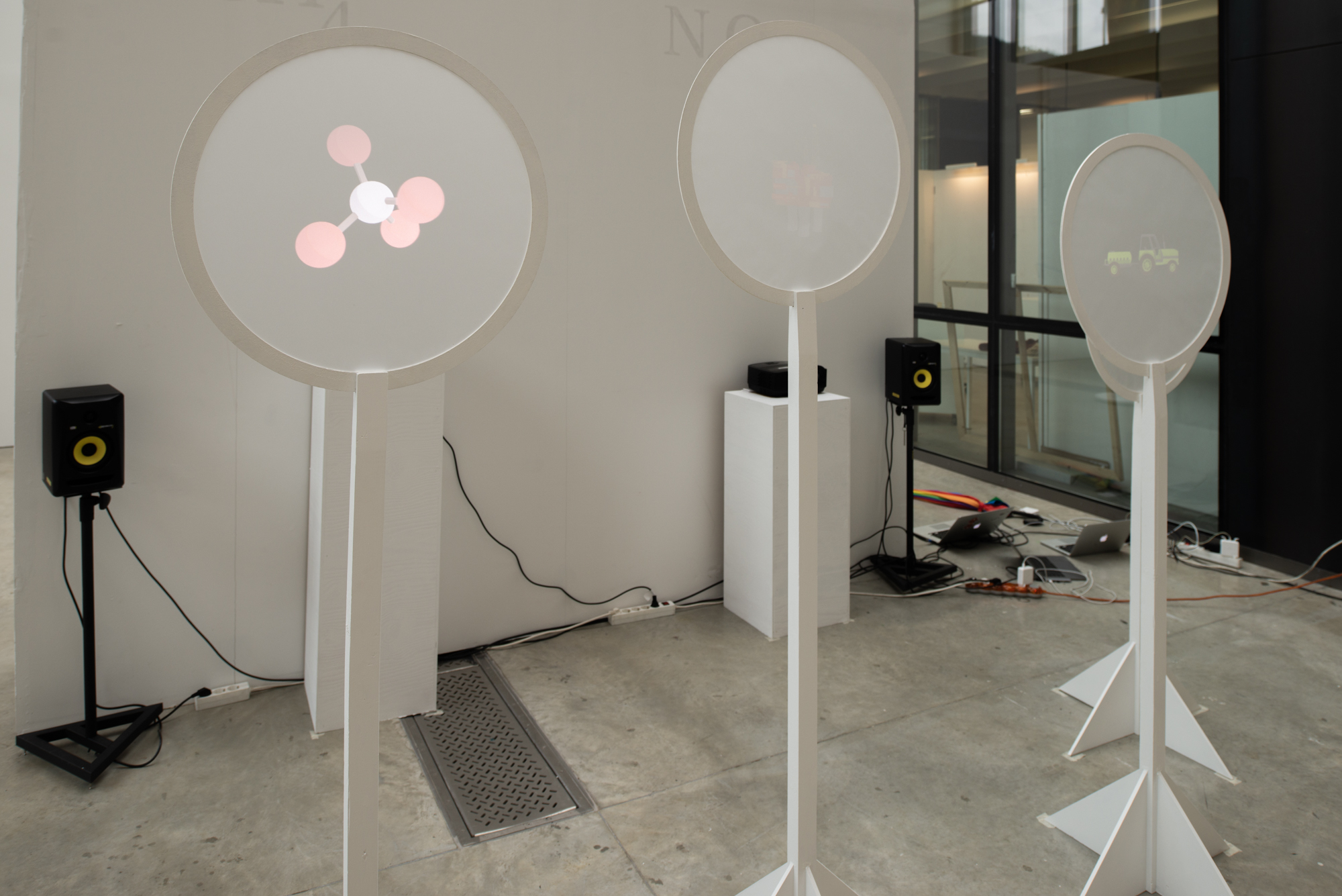
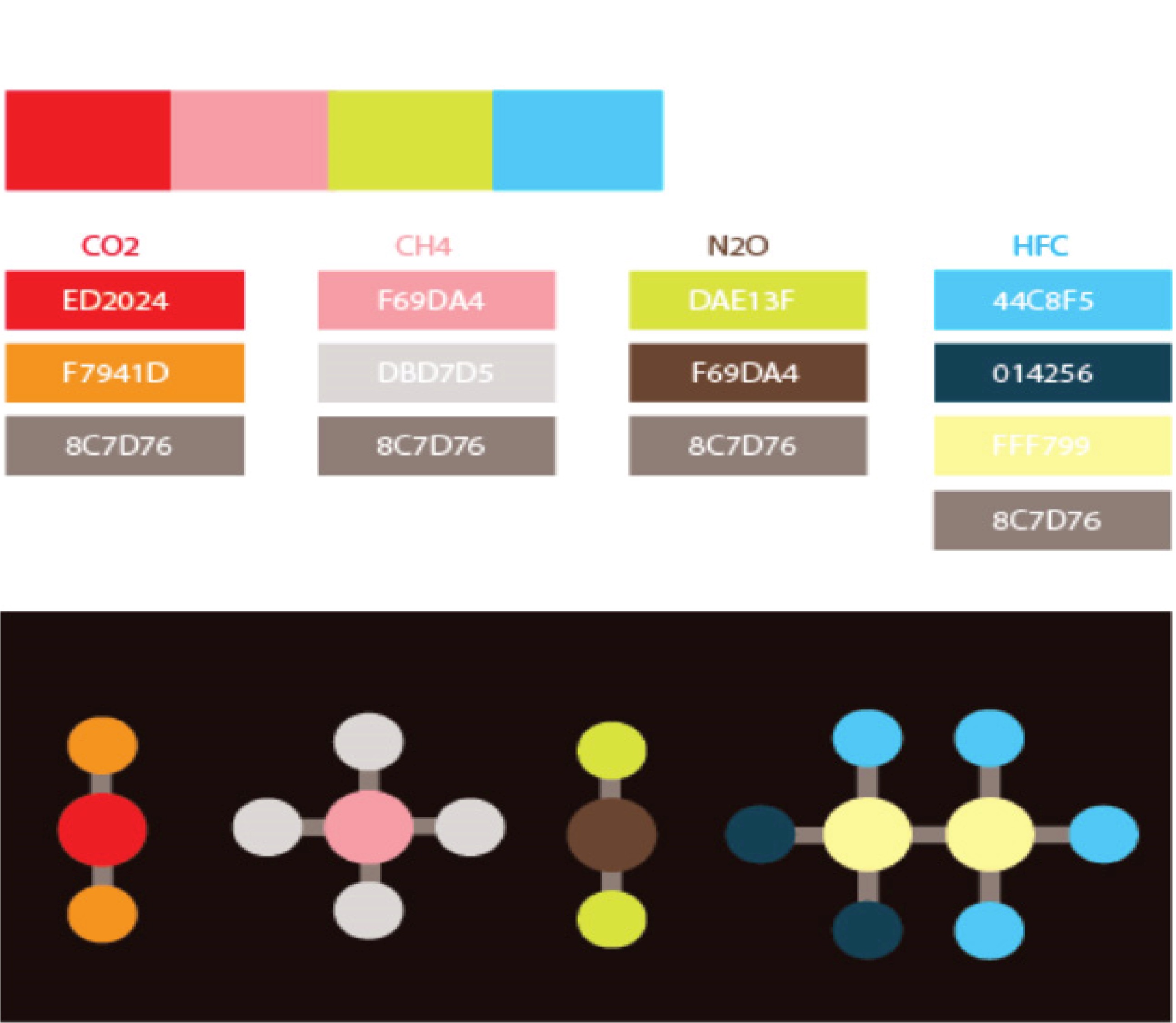
The colors we chose were based on the harmful effects these four greenhouse gasses have on the climate, and on their everyday use.
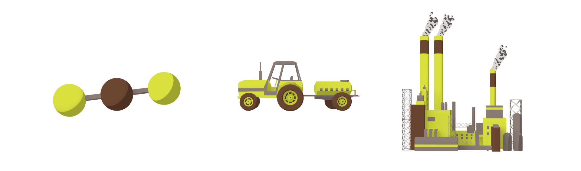
CO2 - hot, fire, fule
CH4 - agriculture, food production
N2O - fertilizer
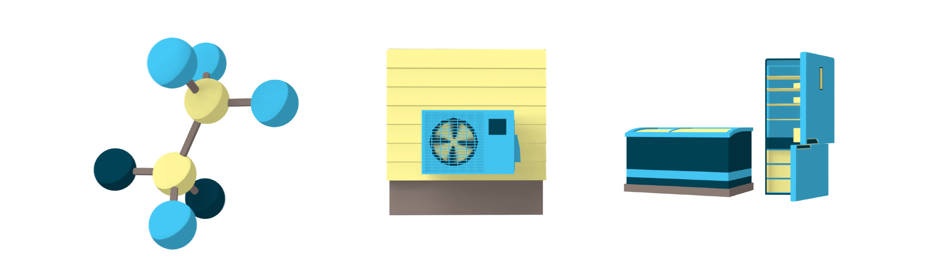
HFC - air conditioning, refrigerant
Since our intentions was to make the audience get a sense of anxiety and insecurity, we deliberately selected colors that were not entirely clean. Colors that’s not very comfortable.
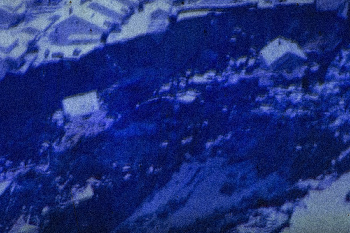
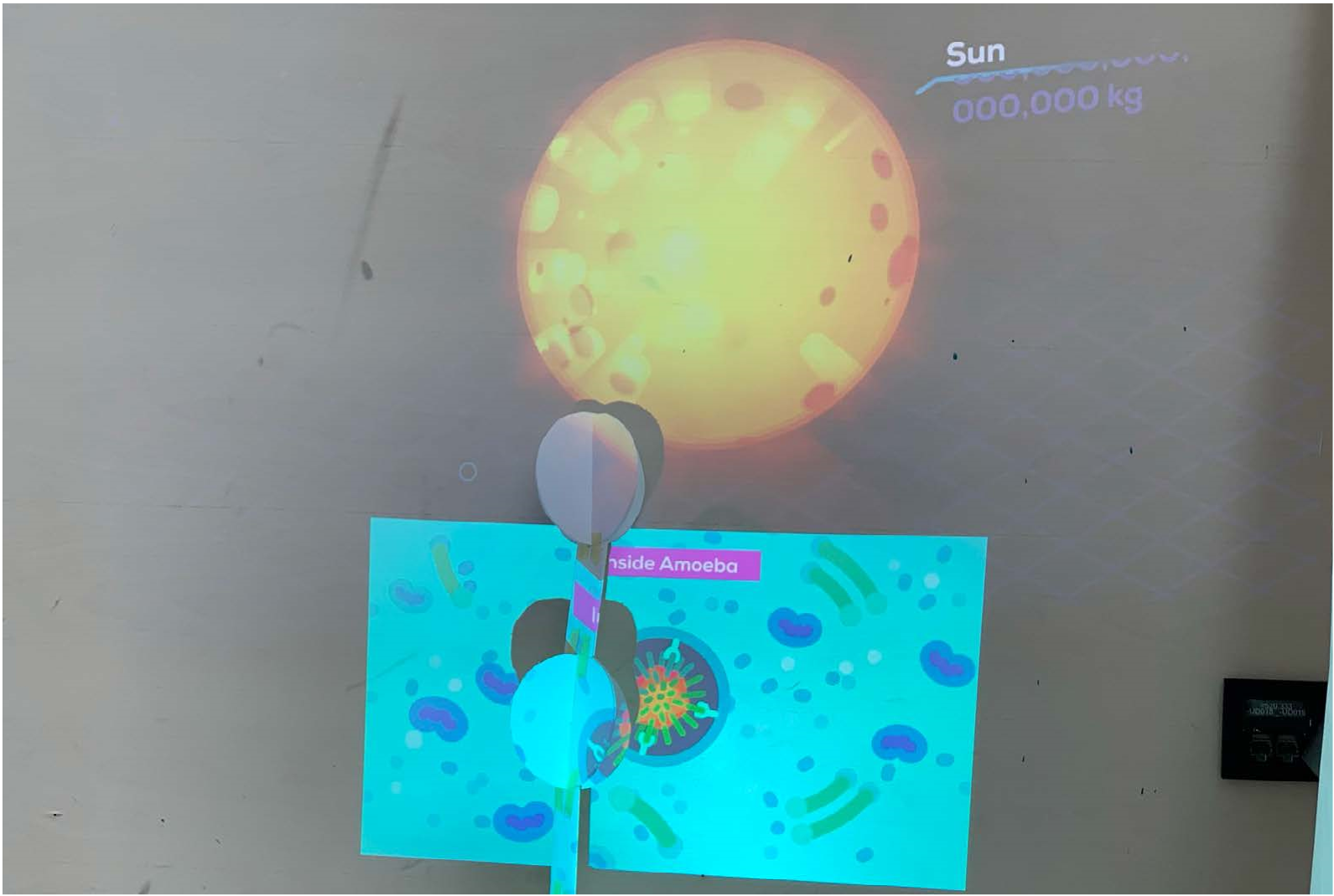
We proceeded to make sketches of the molecules the gasses consists of, and decided to animated them into four videos that showed their origin. The gasses come from factories, from cars, from food production, from air conditioning etc.
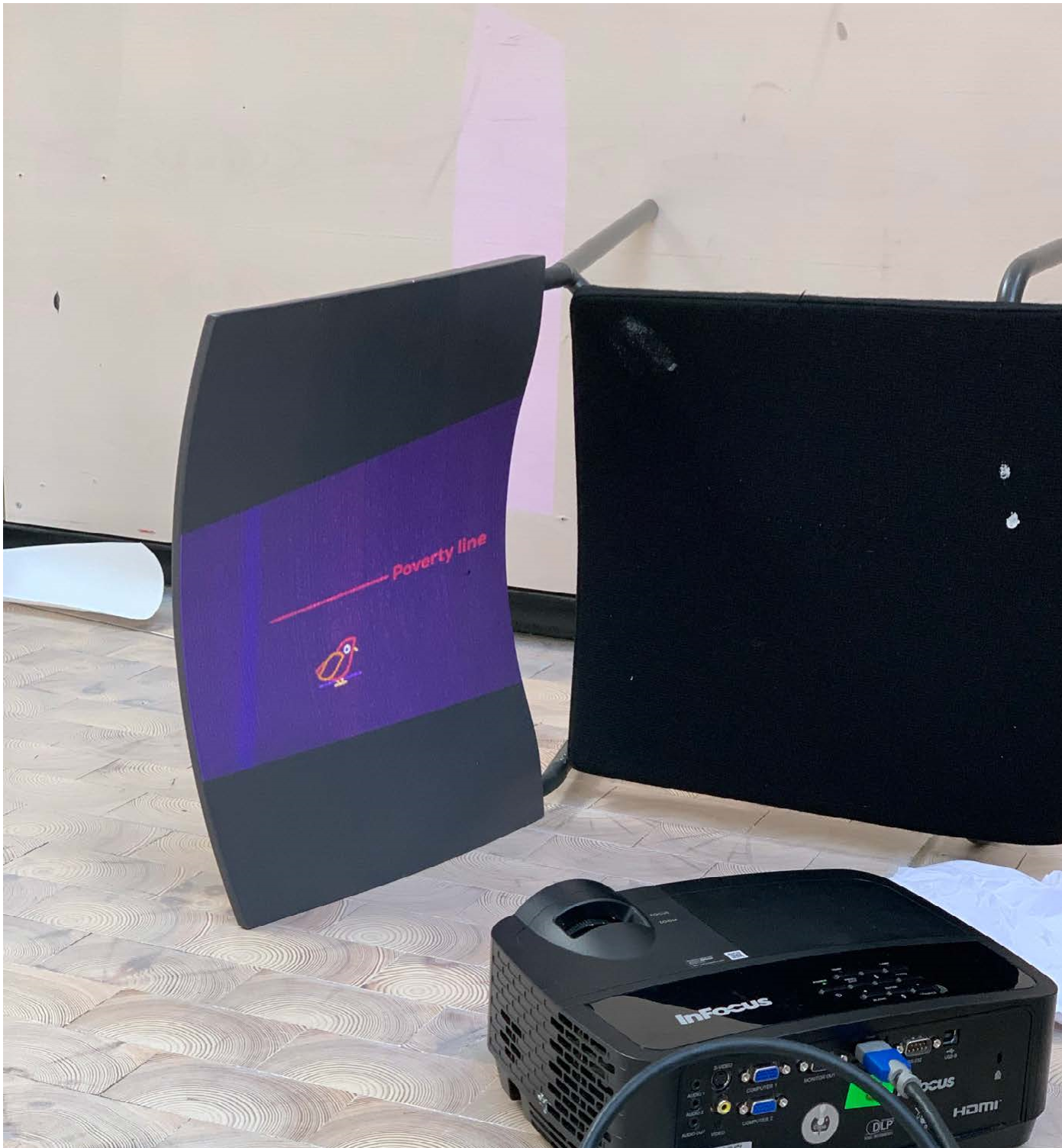
Final illustrations
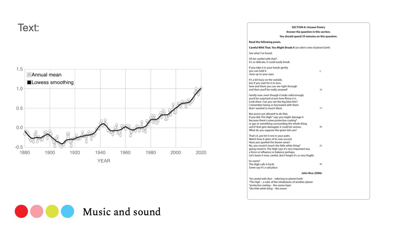
Text, music and sound
Our intention was to use music to create an atmosphere in which the audience could feel a certain amount of anxiety and insecurity. By listening to the sorronding sounds, one could feel the movement of the sounds, since they came from different directions.
The music was a kind of ambient music recorded from a construction site nearby, mixed with some additional industrial sounds, and made into the rythme and beat in the music. We chose to use these sounds because vehicles, construction sites and factories create gases that harm the environment.
There were two text pieces within the music. One was about the increase of average temperature, to remind us of the fact that the earth is getting warmer and warmer, and the other a poetry about environment.
The recording lasted for 7,8 minute before it went over in a loop. This was because we wanted the audience to hear something new every time they passed by. If one wanted to watch the animation and listen to the whole piece of music, it could also put the audience in the mood we wanted to create.
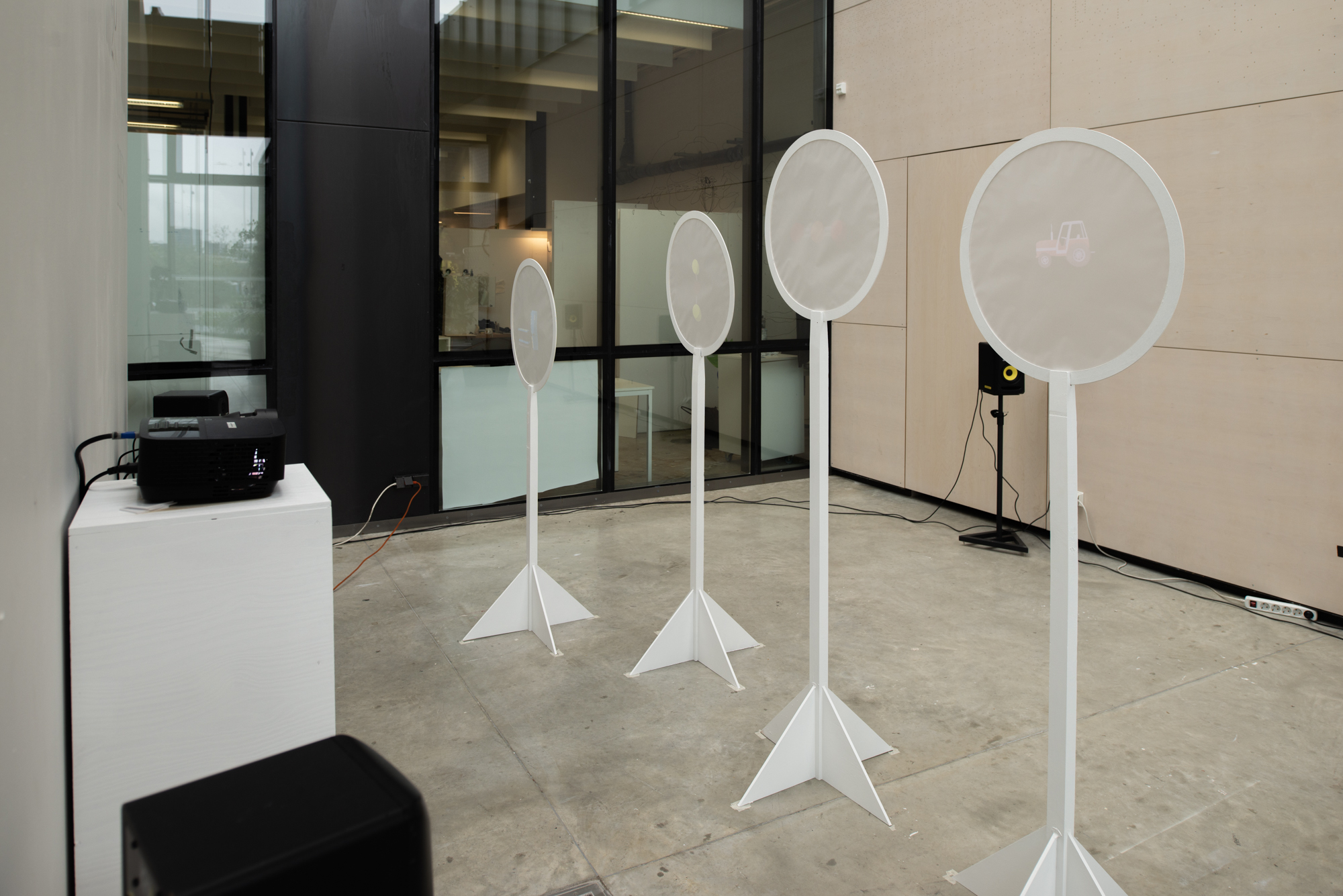
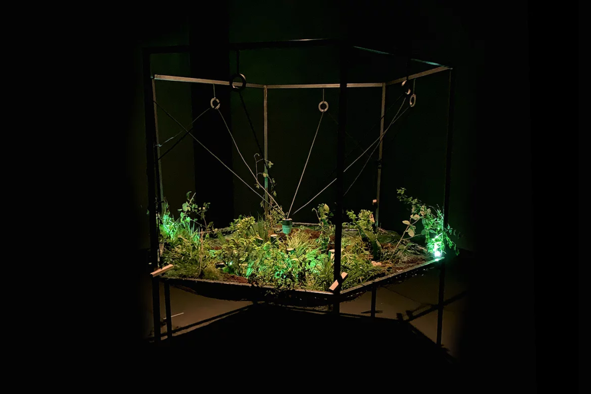
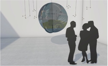
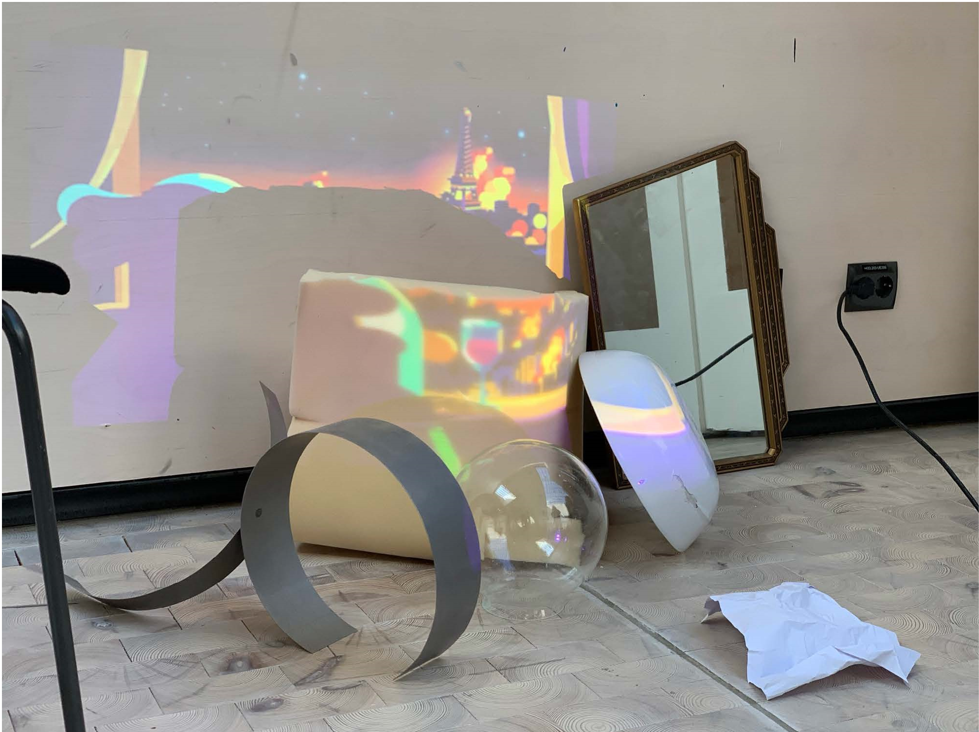
Final animations and installation
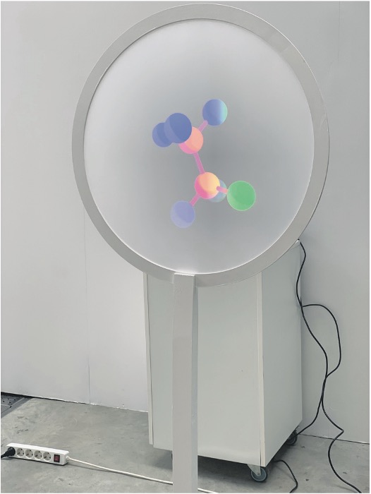
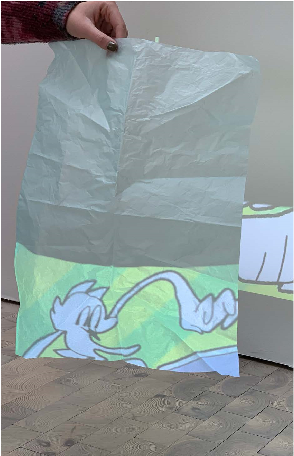
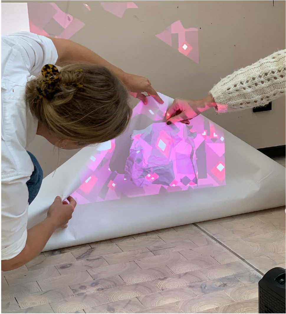
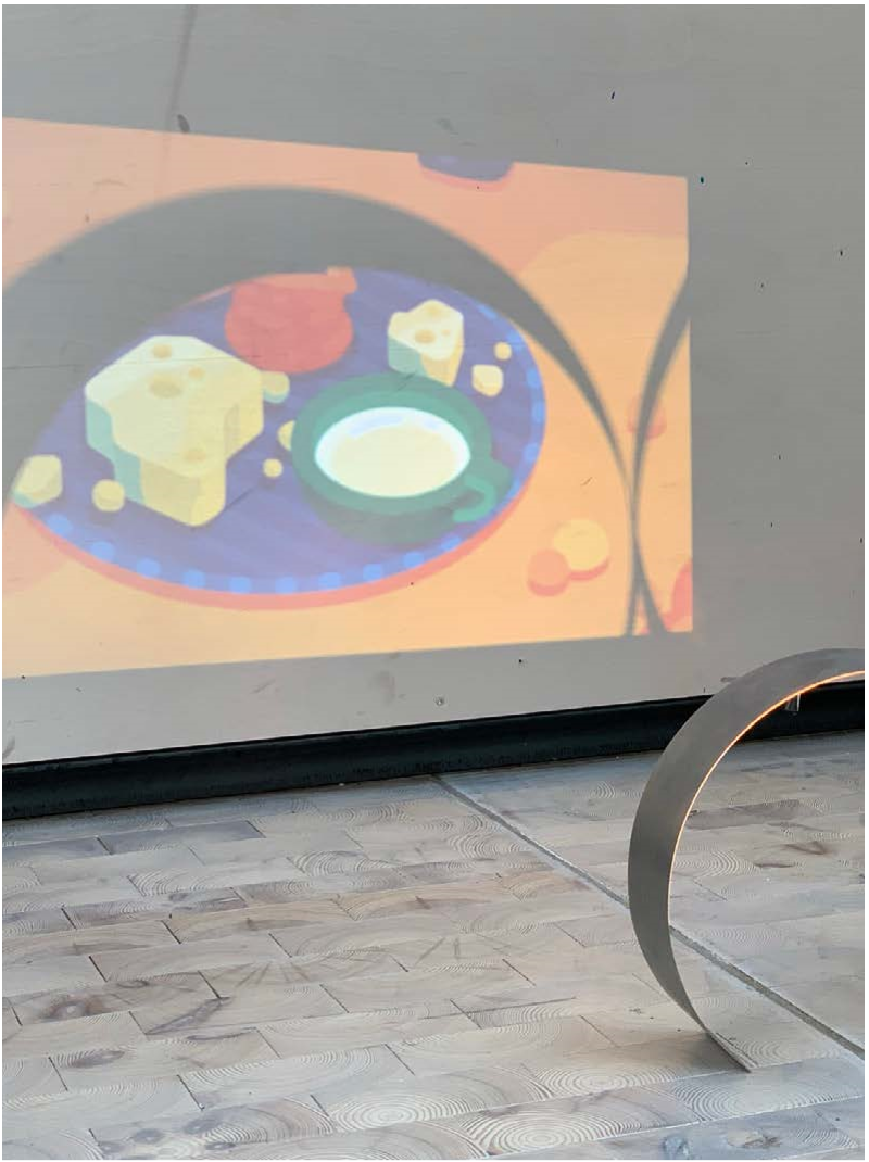
Our essential idea was to trap the gas in a bubble and enlarge it. As a result, the projection surface itself took on a shape that reflected a magnifying glass.
We chose tracing paper for the projection surface, which gave a cool effect when the projection came out perfectly on the other side of the paper, just mirrored. The image also became sharper on the mirror-inverted side, which in turn created an effect where the design became less and less visible the more one saw it from an angle.
In the final installation the animation for each greenhouse gas were projected on four separate stands, and were set to go in a loop so the audience could see them no matter when they passed by.